Widget Editor User Interface Explained
Overview
In Bizagi, you can extend the user interfaces by using Bizagi Widgets. To create your own Widgets, you can utilize the online Widget Editor provided by Bizagi Ltd. Before moving on, ensure you have read about Creating Widgets.
Widget Editor Access
To access the Widget Editor, use any browser of your choice (Google Chrome is recommended).
-
Navigate to the following URL:
https://www.bizagi.com/widgeteditor/ -
You will be presented with options to either start creating a new Widget or load an existing one (from your recently worked widgets or from a
.bwgfile):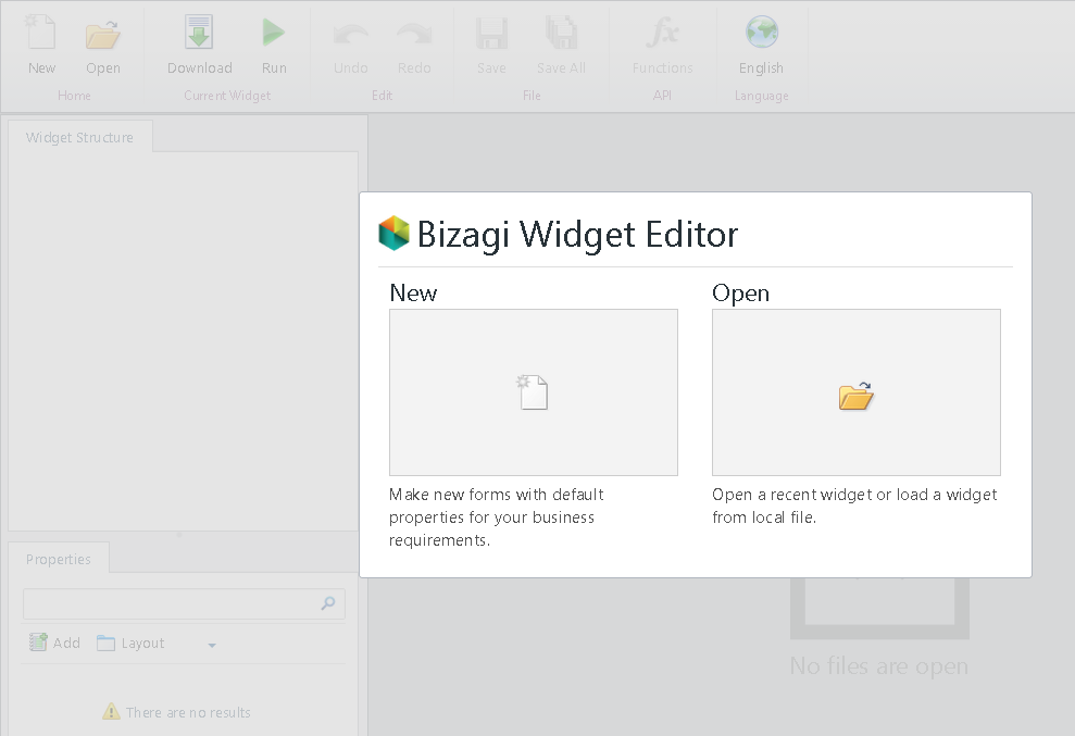
New Widget
Click on New to create your Widget from the default starting template. Make sure you:
- Define the Widget's name by editing the default name. You can localize the name in English and Spanish by clicking on the small icon to the right of the field.
- Select the Widget's type: Choose User control for a regular Widget or Column for a Widget displayed inside a table (once per row).
- Define the category in which the Widget will be presented in the forms designer. Localization options for English and Spanish are available here too.
- Provide a brief meaningful description for your Widget.

The default template provides everything you need, and it shows an initial "hello-world" behavior. You can use the Run option immediately to test it and verify your modifications.
Open Widget
Click on Open to restore the progress of one of your Widgets or to load an existing one and modify it. You will also see a list of recently worked-on Widgets.
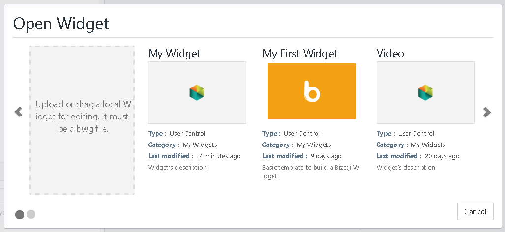
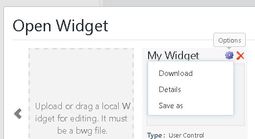
Additionally, you can download recent Widgets or view further details through the options:
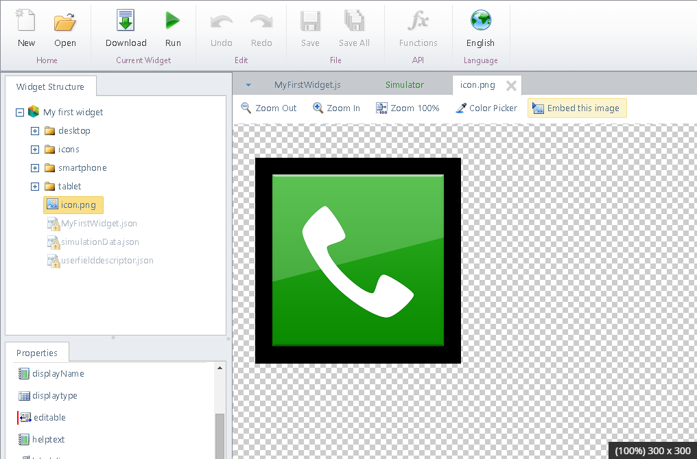
Widget Editor User Interface
Once you start working on a Widget, the Widget Editor will present the UI as described below.
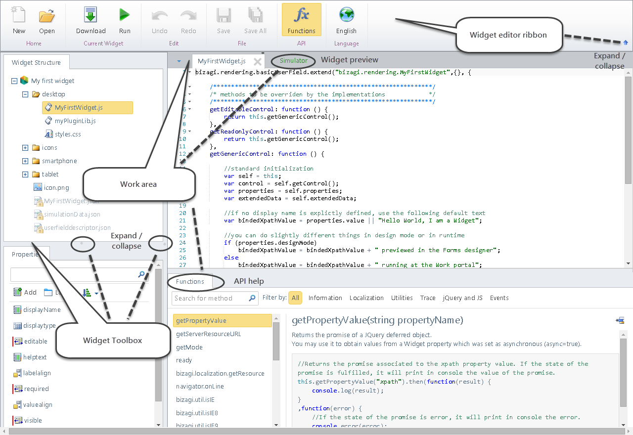
Upper Ribbon
The upper ribbon provides the management options for developing your Widget:
- New: Allows you to create a new Widget, as described above.
- Open: Allows you to open an existing Widget, as described above.
- Download: Saves your progress and builds your Widget as a
.bwgfile, which is downloaded to your local drive. It’s recommended to save your work periodically. - Run: Simulates the Widget’s behavior at runtime. The built-in Simulator will launch a preview of your Widget's behavior in Bizagi forms. Your current progress is saved when using the Run option.
- Undo / Redo: Takes back the last action or includes the last undone action.
- Save: Saves the current file you’re working on.
- Save All: Saves all of the current progress of your Widget (all files).
- Functions: Shows a list of available functions for the Widget API in the lower part of the work area, with documentation and examples.
You can switch the language of the Widget Editor using the Language selector located in the upper right. Available options are English and Spanish.

Widget Toolbox
The toolbox consists of two panels: Widget Structure and Widget Properties. You can toggle the visibility of each panel to optimize the work area’s space.
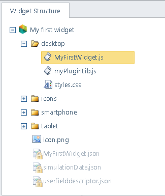
1. Widget Structure
This panel is located at the upper part of the toolbox and shows all the internal files and folder structure of a Widget.
- Double-click on any file to open it and edit it in the work area.
- Right-click any file to delete or rename it.
- Drag and drop files into the structure to include them in your Widget.
2. Widget Properties
This panel is located at the lower part of the toolbox and shows all of the current properties of the Widget. The properties allow the Bizagi Studio user to configure the Widget so that it becomes a reusable UI building block.
- Search for a property using the search box.
- Add a new property by specifying its unique name, display name, and type.
- Layout: Design how these properties are presented for the Bizagi Studio user to configure.

Work Area
The work area will present tabs with any files you are working on.
1. Working with Images
If working with images, the work area will show the image preview. Supported image files include .png, .jpg, .jpeg, and .gif.
Options for working with images include:
- Zoom In / Zoom Out / Zoom to 100%: Allows you to preview the image with zooming options.
- Color Picker: Allows you to pick colors from specific spots in your image.
- Embed Image: Encodes your image into bytes to use in your JS or CSS code.
2. Working with JS Files
When working with JavaScript files, you will see line numbers and the code with IntelliSense features. You can toggle the Functions option to view a list of the Widget API and its help.
3. Simulating Your Widget
When simulating your Widget (via the Run option), you will see a preview of your Widget’s behavior when accessed on any device.
For more information, refer to Simulating your Widget.