Grouped Table
Use
The Grouped table control presents a table with columns as defined in the Forms Designer and rows populated according to each Case. The main difference with the Table control is that records can be grouped according to values of one or more of its columns.
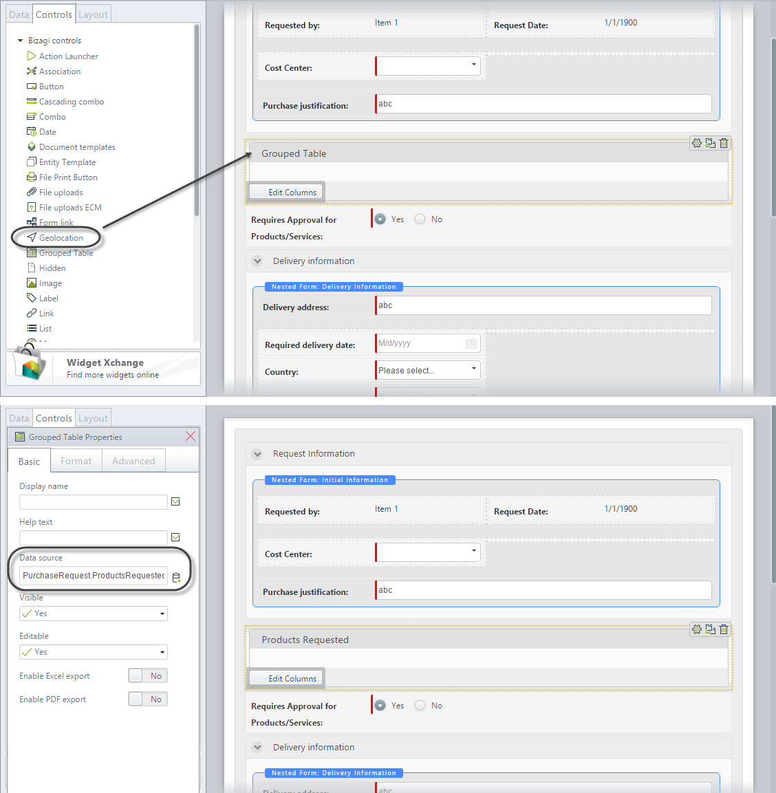
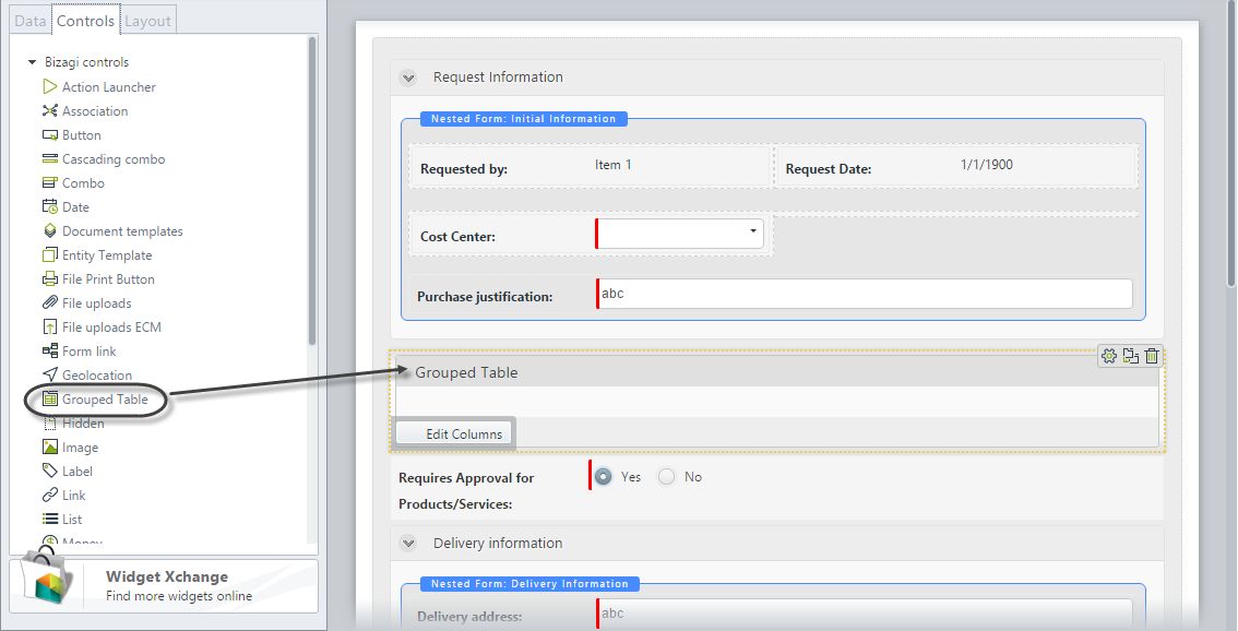
To create a Grouped table in a form, drag and drop a Grouped table control from the Controls tab and then associate a collection.
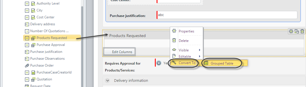
Alternatively, you can drag and drop a Collection attribute to the Display area. This will be interpreted in Bizagi as a Table control. Right click the table and select the option Convert To. In the available options select Grouped table.
Considerations
- By default, Grouped tables have the ability to add new records and delete existing records.
- If the Editable property is disabled, end users will NOT be able to add, edit, or delete records.
- Grouped table validations are independent of the form's Actions & Validations option.
- The following differences exist between the Table and Grouped table controls:
| TABLE | GROUPED TABLE |
|---|---|
| Does not allow grouping records of a collection according to the values of one or more columns. | Allows grouping records of a collection according to the values of one or more columns. |
| Allows Inline addition. | Does not allow Inline addition. |
| Allows Inline edition. | Does not allow Inline edition. |
| Allows pagination. | Does not allow pagination. |
| Form actions can be applied over columns. | Form actions cannot be applied over grouped columns. |
Adding Records
- Records can be added with an independent Add form.
- Inline Add is not available in the control.
Editing Records
- Records can be edited in an independent Edit form.
- Inline Edit is not available in the control.
Detail Options
- You can create a Detail form to display supplemental read-only information in a separate form.
Related to Attribute Types
Grouped tables are related to Collections that require a one-to-many relationship.
Properties
Every control has a set of properties that allow you to customize their behavior in the Work Portal. However, some properties are exclusive to a specific control. The following properties are restricted to the Grouped table control:
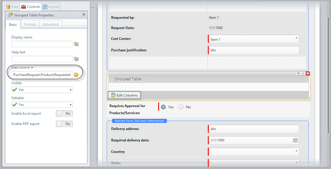
Basic Tab
| PROPERTY | DESCRIPTION |
|---|---|
| Editable | The Editable property can be enabled, disabled, or defined by an expression. If disabled, the end user will not be able to add, edit, or delete any records. However, they will still be able to view the Detail form where attributes are displayed on a read-only basis. |
| Enable Excel export | Shows or hides an icon below the Table that allows exporting to Excel the information contained in the table. In Excel, the records of the table will be ordered according to the groups defined but groups will not be explicitly shown. |
| Enable PDF export | Shows or hides an icon below the Table that allows exporting to PDF. In the PDF file, the records will be ordered according to the groups defined but groups will not be explicitly shown. |
Format Tab
| PROPERTY | DESCRIPTION |
|---|---|
| Initially collapsed | The tables can be collapsed (just as Groups work). This property is used to define if a table is initially shown expanded or collapsed. By default, tables are created expanded. |
| Editing buttons top | This property defines if the editing buttons (edit, delete, detail) are shown on the top of the table, just underneath the header, or under the table footer. |
| Rows per page | Configures the number of rows shown per page. By default, Bizagi will display 20 rows per page. The navigation through the paginated tables is very friendly. Just hover the mouse pointer over the page numbers; the numbers will start moving so you can select the one desired. |
| Orientation | Defines if the text should be written from left to right or vice versa. The Inherited option indicates the property will be set according to the language selected in the Work Portal. |
| Format | Changes the look of the text by customizing the size and formatting, such as font type, font style, and background color. |
| Header format | Customize the appearance of the table's headers. You can change the background color, font size, and font color of headers. |
| Is Sortable | Define if the columns inside the table can be sorted by their information (except for the Image, File uploads, ECM, and Document Template type of information). This option is not available in offline forms as it is not possible to sort columns offline. |
Advanced Tab
| PROPERTY | DESCRIPTION |
|---|---|
| Sort by attribute | Sorts the Table rows in an order based on the value of the attribute selected in the collection entity. When an attribute has been selected, you must define if the order is ascending or descending. Clicking the Set to default value icon will reset this property to no sorting. |
| Filter | Allow defining a smaller set of values from the total records in the table. Bizagi will only display the records that meet the filter condition defined in a Boolean expression. |
| Table validations | Enables defining validation rules for this control that will be verified at run-time. |
| Delete options | Handle deletions of records. By default, deletion is permitted. The property also allows displaying a customized tooltip when the mouse pointer hovers over the delete icon in the Work Portal. |
| Add options | Enables adding records to the Table. An Add Form has to be defined to capture the new data. This form is facilitated by the Add Form property. Validations can be performed while adding records. They are executed as the end user clicks the Save button in the Add Form. |
| Row options | The group is divided into two sections: Edit and Detail. Allowing row edition implies that you can modify the information related to a record. Editions are disallowed by default. You can edit records in an independent window (pop-up form) called the Edit form. Validations can be performed while editing records. They are executed as the end user clicks on the Save button in the Edit Form. |
| Detail | You can specify a read-only view of rows. If this property is enabled, you must create or select a pop-up form for display. |
Grouped Table Columns
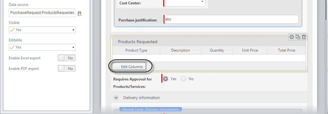
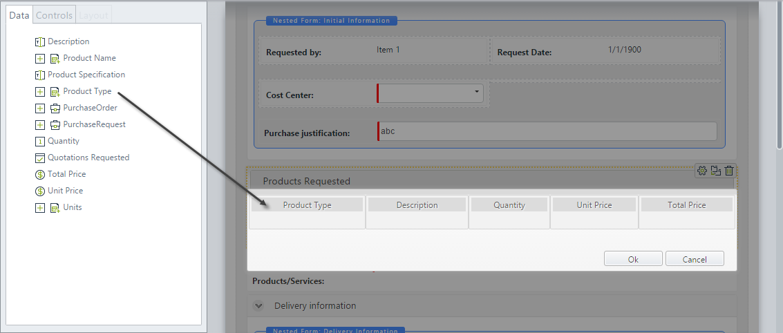
To define the columns of a Grouped table, click the control and then click the Edit columns button.
A new window will display with the collection attributes available in the Left Panel. You can drag-and-drop or double-click attributes to add them as columns.
Columns keep the same properties related to the type of control (data) they display. Additionally, the following properties are exclusive to the columns:
Basic Tab
| PROPERTY | DESCRIPTION |
|---|---|
| Visible | Defines if the whole column is visible or not. |
| Editable | Defines if the whole column is read-only or not. |
| Required | Defines if the whole column is required or not. |
| Cells editable | Defines an expression to evaluate row conditions and establish if a specific cell is editable or not. |
| Cells visible | Defines an expression to evaluate row conditions and establish if the value contained in a specific cell is visible or not. |
Format Tab
| PROPERTY | DESCRIPTION |
|---|---|
| Title horizontal align | Allows aligning the column title. Possible options are: right, left, justified, and centered. |
| Column horizontal align | Allows aligning text in columns. Possible options are: right, left, justified, and centered. |
| Columns width | Allows defining the desired column width according to your needs. It can be established in terms of percentage of the total table's width or in terms of fixed pixels. |
Advanced Tab
| PROPERTY | DESCRIPTION |
|---|---|
| Apply filter to each row | Allows applying filters individually to each of the rows in the Table, in order to display specific information. |
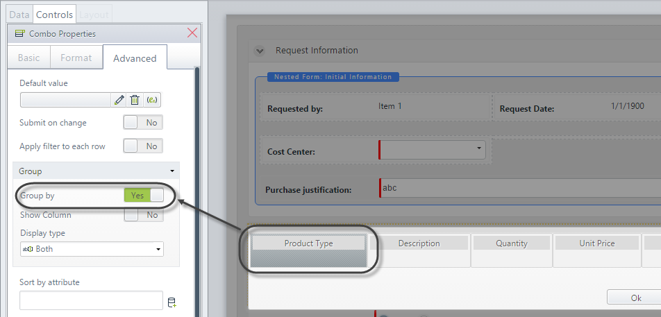
| Group | In the group section, you find three properties: Group by (defines if the records of the table are grouped based on the values of the column), Show column (shows or hides the column used to group the records of the collection), and Display type (enables different visual formats in respect to the text and control). |
| Totalizer | Allows defining aggregate functions applied to the column to obtain a unique value, which will be shown at the bottom of the column. |
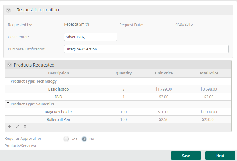
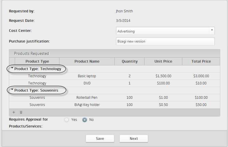
Example
The following table lists products that need to be purchased in a company. It is desired to group the products according to their type. To do so, we will include a Grouped table.
- Go to the Forms Designer. Drag and drop a Grouped table control from the left panel.
- Click the table and associate the collection that contains the records to be displayed in the Data source property.
- Click the Edit columns button. In the new window, drag-and-drop or double-click attributes to add them as columns.
- In this case, the table will be grouped according to the values of the Product type attribute. To configure this, click the Product type column, go to the Advanced properties tab, and enable the Group by option.
-
Save and close the Form.
-
Go to the Work Portal to test the control. Note how the records are now grouped.