Table
Use
The Table control presents a table with columns as defined in the Forms Designer and rows populated according to each Case.
- Drag and drop a Collection to the Display area to create a Table Control.
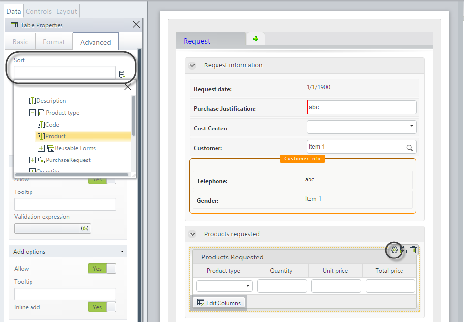
- Click on Edit columns to create the columns of the table in a new window.
- Navigate the data model from the many-entity of the collection, select the required attribute, and drag it onto the Table control to become a column.
Considerations
- By default, Tables have the ability to add new records and delete existing records.
- By default, Tables are shown expanded.
- Table cells are aligned to top center.
- If the Editable property is disabled, end users will NOT be able to add, edit, or delete records.
- Table validations are independent of the form's Actions & Validations option.
- If one or more columns of your table are mandatory, we encourage using an expression to validate that the column is filled. Bizagi pages tables starting from 20 rows by default and will not validate mandatory columns that are not displayed. Use Table validations option in the Advanced tab to create this validation.
Adding records
- Inline: A fast way to create and fill a new record.
- Add Form: Records can be added with an independent Add form. This method is preferable when a large amount of data must be collated. It must be chosen when data needs to be validated, as the inline method does not support validation.
- Inline addition is the default.
Editing records
- Inline: Records can be edited Inline.
- Edit Form: Records can also be edited in an independent Edit form that takes the end user to a new window. This method is required for editing large amounts of data or where data requires validation.
- Inline edition is the default.
Detail options
You can create a Detail form to display supplemental read-only information in a separate form.
Related to attribute types
Tables are related to Collections that require a one-to-many relationship.
Properties
Every control has a set of properties that allow customizing its behavior in the Work Portal. However, some properties are exclusive to a specific control. The following properties are restricted to the Table control:
Basic tab
| PROPERTY | DESCRIPTION |
|---|---|
| Editable | The Editable property can be enabled, disabled, or defined by an expression. If disabled, the user will not be able to add, edit, or delete records. |
| Enable Excel export | Show or hide an icon that allows export to Excel the information contained in the table. |
| Enable PDF export | Show or hide an icon that allows export to PDF the information contained in the table. |
You can easily export the content of tables to Excel or PDF from the Work Portal, to obtain the data displayed in a specific table by clicking a button. The information exported is as displayed in the table. That is, filters are taken into account.
Format tab
| PROPERTY | DESCRIPTION |
|---|---|
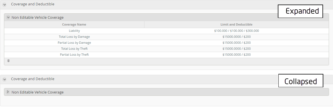
| Initially collapsed | The tables can be collapsed (just as Groups work). This property is used to define if a table is initially shown expanded or collapsed. By default, Tables are created expanded. |
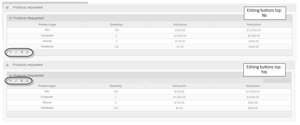
| Editing buttons top | Defines if the editing buttons (edit, delete, detail) are shown on the top of the table, just underneath the header, or under the table footer. |
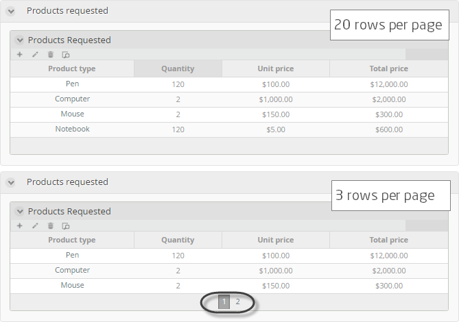
| Rows per page | Configures the number of rows shown per page. By default, Bizagi will display 20 rows per page. |
| Orientation | Defines if the text should be written from left to right or vice versa. The Inherited option indicates the property will be set according to the language selected in the Work Portal. |
| Format | Changes the look of the text by customizing the size and formatting; for example, font type, font style, and background color. |
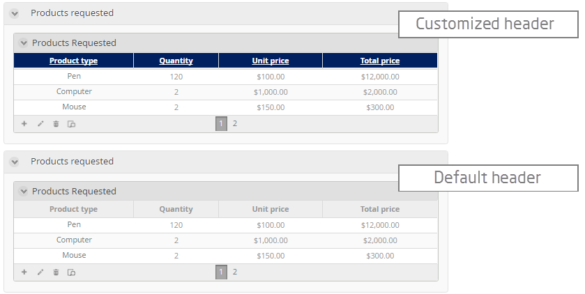
| Header format | Customize the appearance of the table's headers. You can change the background color, font size, and font color of headers. |
| Is Sortable | Defines if the columns inside the table can be sorted by their information (except for Image, File uploads, ECM, and Document Template type of information). This option is not available in offline forms as it is not possible to sort columns offline. |
Initially collapsed example
By default, the table is shown expanded as the Initially collapsed property is set to false.
Editing buttons top example
The following image shows a table with the edit buttons under the table footer and on the top of the table header.
Rows per page example
The following table contains four records or rows. When the Rows per page property is set to three (3), Bizagi pages the Table so that each page displays a maximum of three rows only. This table will display three records on page one, followed by one record on page two.
Header format example
The following image shows a table with and without header customization.
Advanced tab
| PROPERTY | DESCRIPTION |
|---|---|
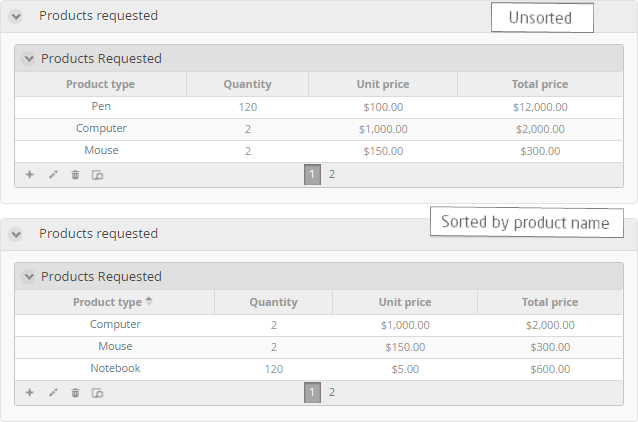
| Sort by attribute | Sorts the Table rows in an order based on the value of the attribute selected in the collection entity. When an attribute has been selected, you must define if the order is ascending or descending. |
| Filter | Allows defining a smaller set of values from the total records in the table. Bizagi will only display the records that meet the filter condition defined in a Boolean expression. |
| Table validations | Enables defining validation rules for this control that will be verified at runtime. |
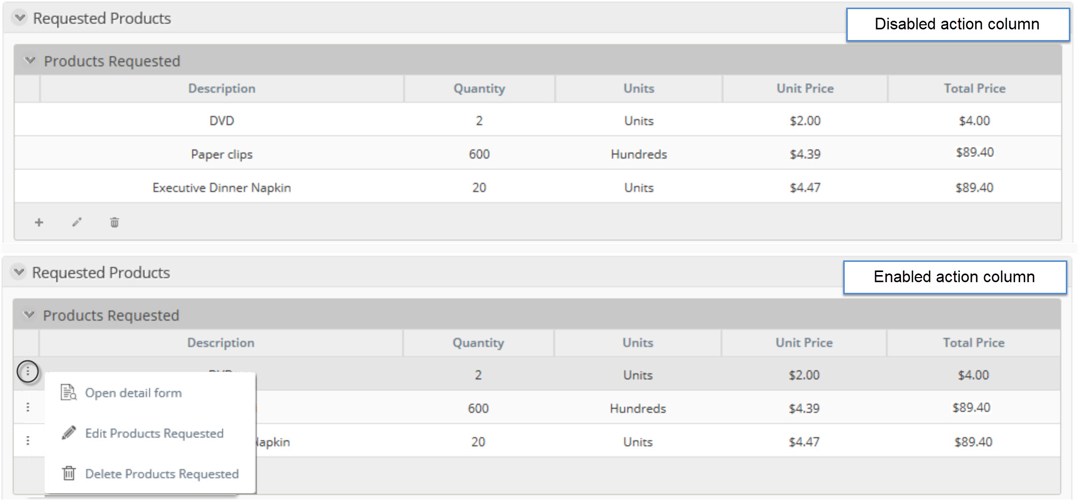
| Enable actions column | If enabled, adds an extra column to the left with a three-dot menu that allows users access to a menu where they can delete, edit, and open a record's detail with just one click. |
| Floating Header | If enabled, keeps the main pane of the table in the Work Portal visible while you scroll. |
| Delete options | Handles deletions of records. By default, deletion is permitted. The property also allows displaying a customized tooltip when the mouse pointer hovers over the delete icon in the Work Portal. |
| Add options | Enables adding records to the Table. Inline additions are allowed by default. Alternatively, an independent pop-up form (Add Form) can be displayed in the Work Portal to capture new data. |
| Row options | Divided into two sections: Edit and Detail. If enabled, rows can be edited or viewed as read-only. |
Sort by example
Enable actions column example